The Beveridge Curve refers to relationship between job vacancies and unemployment or, more generally, between business sector recruiting activity and household sector job search activity.
Theoretically, the Beveridge Curve should be negatively-sloped in V-U space. When economic prospects look promising, firms wanting to expand capacity begin to post more vacancies. For a given level of unemployment, there is an increase in labor market tightness (V/U) which makes finding a job easier for unemployed workers. The unemployment rate declines as the vacancy rate rises. The reverse holds true when economic prospects are diminished.
Empirical Beveridge Curves don't always have the clean shape suggested by theory. Sometimes, the Beveridge Curve appears to "shift." Beginning with Lilien (1982), there's been an inclination to interpret shifts in the Beveridge Curve as reflecting the effects of "structural" shocks as opposed to the "cyclical" shocks that drive the normal U-V dynamic. For some recent work in this area, see my interview with Gianluca Violante here: "What Shifts the Beveridge Curve? Recruitment Effort and Financial Shocks."
I'm not going to provide much in the way of analysis in what follows. The primary purpose of this post is just to share some data that may or may not stimulate some hypotheses. Let me begin with the BC using the JOLTS data.
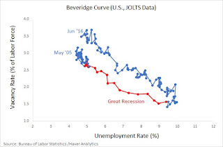
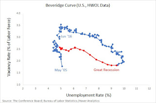
Here you see the familiar cyclical pattern driven by the Great Recession and recovery. Except that the BC appears to have shifted outward. In other words, given present levels of recruiting intensity, we would have expected (based on historical experience) the unemployment rate to be significantly lower. The pattern is similar if we instead use an alternative measure of job vacancies from the HWOL (the Conference Board Help Wanted Online series).
Because the size of worker flows between employment and out-of-the-labor-force are as large as the flows between employment and unemployment, I sometimes like to use a broader measure of job search (available to work) like nonemployment (you may prefer one of the alternative measures listed here.)

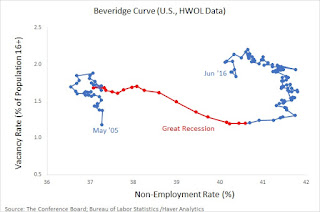
This representation of the data suggests that the U.S. labor market looks a lot different today than it did prior to the Great Recession.
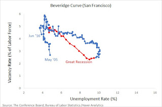
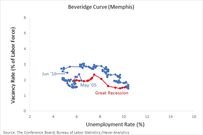
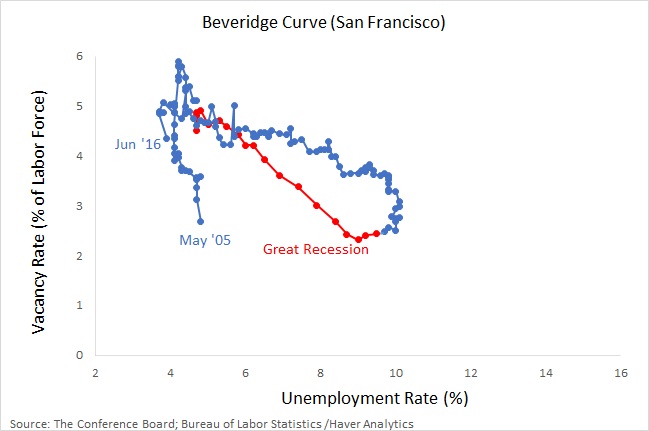
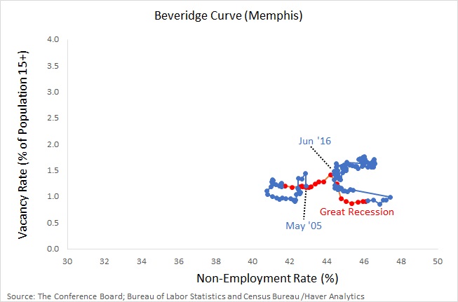
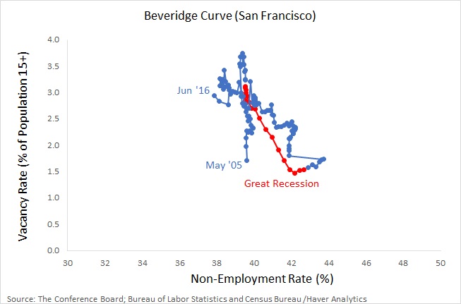
One of the benefits of the HWOL data is that measurements are available at the MSA level. (I also have the benefit of a great research assistant, Andew Spewak, who did all the leg work for us.) Here are few examples.


Or, in terms of nonemployment rates...
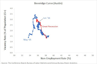

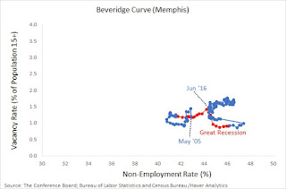
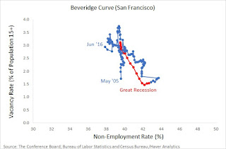
So some MSAs display a relatively stable BCs in V-U and V-N space, whereas others do not.
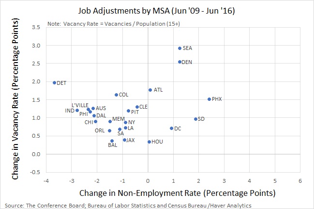
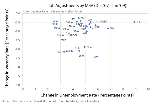
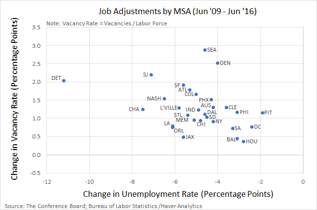
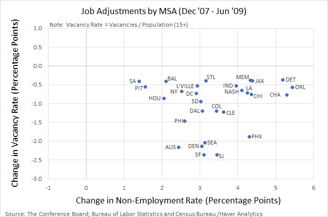
To get some additional sense of the heterogeneity existing at the MSA level, consider the following data, which plots the ppt change in vacancies and unemployment over the recession (2007-09) and the recovery (2009-16) for a set of selected MSAs (most of the largest ones).
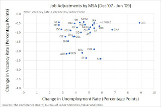
Not surprisingly, the unemployment rate shot up across all the MSAs in this sample and the vacancy rate declined, though not by very much in many jurisdictions. Here is how the same set of MSAs behaved during the recovery.
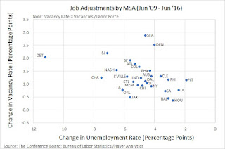
Again, not a very surprising pattern, apart from the extent of the heterogeneity. If we repeat the exercise above replacing the unemployment rate with the nonemployment rate, during the recession we see,
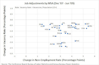
And during the recovery,
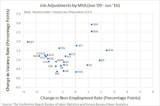
That is, recruiting intensity in the recovery appears to be up across the board. One would expect the employment rate to be up across the board as well. But it is not. MSAs like Seattle, Denver, and Phoenix, for example, have experienced declines in the employment rate despite marked increases in their respective job vacancy rates. These differences are interesting and could have implications for (say) the relative merit of policies targeted at the aggregate vs. sectoral/regional level.
Theoretically, the Beveridge Curve should be negatively-sloped in V-U space. When economic prospects look promising, firms wanting to expand capacity begin to post more vacancies. For a given level of unemployment, there is an increase in labor market tightness (V/U) which makes finding a job easier for unemployed workers. The unemployment rate declines as the vacancy rate rises. The reverse holds true when economic prospects are diminished.
Empirical Beveridge Curves don't always have the clean shape suggested by theory. Sometimes, the Beveridge Curve appears to "shift." Beginning with Lilien (1982), there's been an inclination to interpret shifts in the Beveridge Curve as reflecting the effects of "structural" shocks as opposed to the "cyclical" shocks that drive the normal U-V dynamic. For some recent work in this area, see my interview with Gianluca Violante here: "What Shifts the Beveridge Curve? Recruitment Effort and Financial Shocks."
I'm not going to provide much in the way of analysis in what follows. The primary purpose of this post is just to share some data that may or may not stimulate some hypotheses. Let me begin with the BC using the JOLTS data.
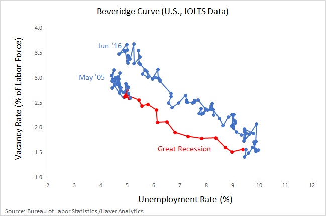
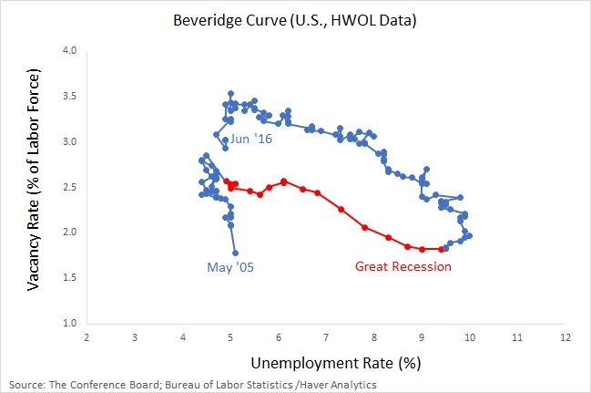
Here you see the familiar cyclical pattern driven by the Great Recession and recovery. Except that the BC appears to have shifted outward. In other words, given present levels of recruiting intensity, we would have expected (based on historical experience) the unemployment rate to be significantly lower. The pattern is similar if we instead use an alternative measure of job vacancies from the HWOL (the Conference Board Help Wanted Online series).
Because the size of worker flows between employment and out-of-the-labor-force are as large as the flows between employment and unemployment, I sometimes like to use a broader measure of job search (available to work) like nonemployment (you may prefer one of the alternative measures listed here.)

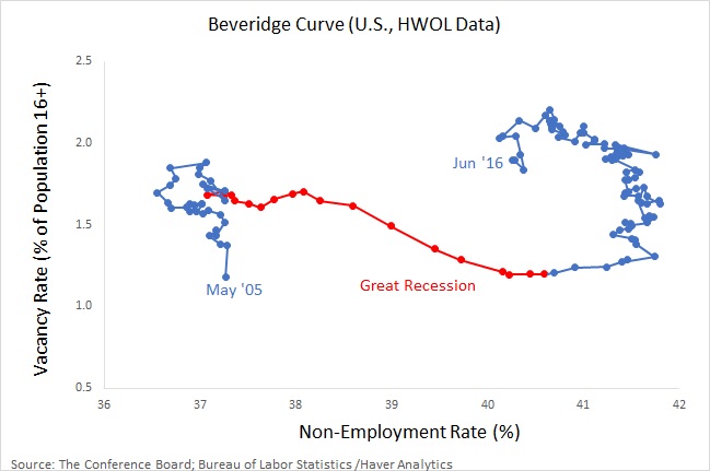
This representation of the data suggests that the U.S. labor market looks a lot different today than it did prior to the Great Recession.
One of the benefits of the HWOL data is that measurements are available at the MSA level. (I also have the benefit of a great research assistant, Andew Spewak, who did all the leg work for us.) Here are few examples.


To get some additional sense of the heterogeneity existing at the MSA level, consider the following data, which plots the ppt change in vacancies and unemployment over the recession (2007-09) and the recovery (2009-16) for a set of selected MSAs (most of the largest ones).
Not surprisingly, the unemployment rate shot up across all the MSAs in this sample and the vacancy rate declined, though not by very much in many jurisdictions. Here is how the same set of MSAs behaved during the recovery.
Again, not a very surprising pattern, apart from the extent of the heterogeneity. If we repeat the exercise above replacing the unemployment rate with the nonemployment rate, during the recession we see,
And during the recovery,